This article applies to:
- Revu 21
- Revu 20
- Revu 2019
- Revu 2018
Jump to other versions:
This installment of Customizing Bluebeam Revu covers the General section of the Revu Preferences dialog.
This article focuses on the changes you can make to the interface’s appearance under the Options subsection. To get to these settings:
- From the Menu Bar, click Revu >
Preferences (Ctrl+K).
- From the list on the left side of the Preferences dialog box, go to General.
- Select Options from the top row of tabs.
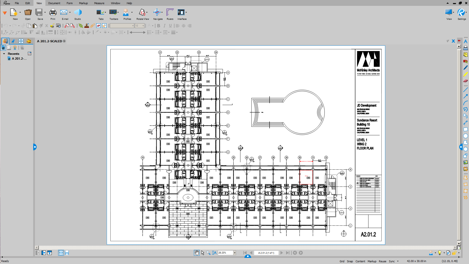
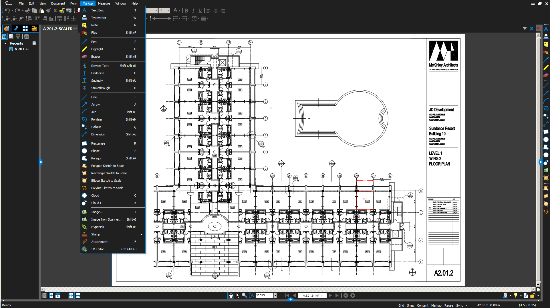
Themes
Depending on the type of environment you work in or the monitor you are using, you may find dark colors or light colors preferable. This is why Revu has a Dark theme and a Light theme. By default, Revu uses the Dark theme.
Show full-screen crosshair
When selected, whenever your cursor is in a workspace, a large crosshair that reaches the edges of the workspace will appear. This crosshair makes it easier to align markups and see exactly where you are clicking.
Document tab truncation
This option determines how file names that appear in document tabs will be shortened.
- Start – Shortens the tab name from the beginning of the file name.
- End – Shortens the tab name from the end of the file name.
Startup mode
These options determine the default mode Revu will start in.
- Last Used – Selects the mode that was in use when Revu was last closed.
- View – Allows you to view PDFs, but disables all editing features (including markups and overwriting documents).
In Revu 20 & below, this mode is mainly intended for unregistered users who only need to view and measure PDFs. Switching from Markup to View mode will also free up a seat for users on Enterprise or Open licensing. - Markup mode – Allows you to use Revu without restrictions.
See also:
- Getting Around the Interface – Learn how to navigate Revu’s interface.
- Tutorial Videos – Browse our in-depth tutorial videos on Revu features and workflows.
- Revu Help – Complete documentation of all Revu features and functions.
Other versions of this article
Revu 2017 and older
This part of our FAQ series on Customizing the Revu User Interface covers the General page of the Revu Preferences dialog window, where you can change the menu behavior and color of the interface.
Before Revu 10, the Revu interface was a lighter color and the menus worked in the “drop-down” style traditionally used in older versions of the Windows operating system. However, with the introduction of the Command Bar, we’d added options to the General section of the Bluebeam Revu Preferences (Ctrl+K) that let our customers have some or all of the look and feel of our previous releases.

Brightness
This setting lets you lighten or darken the color of the Revu interface, while using the newer Command Bar layout

Classic mode
Clicking this checkbox changes the color of the User Interface and behavior of the Command Bar, to what was used before Revu 6. In this mode, the menus use the classic Windows layout, where they “drop down” over the top of the rest of the Revu interface.

Classic Menu
The Classic Menu option retains the darker background introduced in Revu 10, while the using the classic Windows menu layout.

If you’d like additional information about customizing Bluebeam Revu, please use the links listed below to access the rest of the series, and watch a tutorial video on Revu customization:
More information
You can also find information about Getting Around the Interface and actually using the available functions and features in our Tutorial Videos, and the Revu Online Help manual for your version.
How-To
Revu 21
Revu 20
Revu 2019
Revu 2018
Revu 2017 & Below
Preferences
